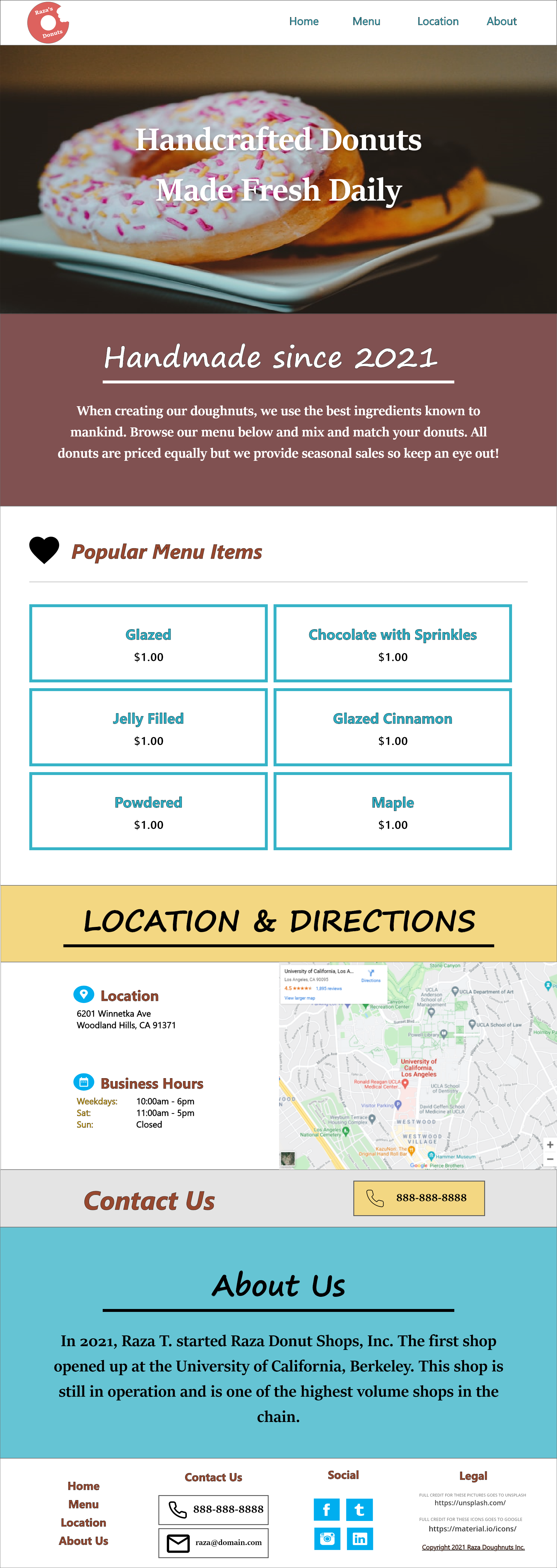
Donut Shop Project
A homepage mockup for a fictional donut shop brand in Los Angeles
The follow excerpt describes the project:
Congratulations! You are opening a donut shop this summer and you need to create a homepage mockup for
your new website.
You want your mockup to identify why your donut shop is the best place to get donuts in Los Angeles.
The more detail you give us, the better understanding we will have of your skillset.
The goal of this exercise is to help us understand your creative ability, decision making,
and overall common sense.
**This is a fictional brand and for purposes of this project only**
- Please name the donut shop after yourself. Example: Karley's Donuts.
- Your mockup should have a clear and defined color palette
- Your mockup should have a clear and defined call-to-action.
- Your mockup should have at least 3 content sections between the header and footer.
Solution:
For this project I took a lot of inspiration from pics found from Dribble and Pinterest. I additionally looked at a few competitor websites by searching up "Donut Shop Website" on Google to mainly to see what types of content do these websites use.
During the research phase I liked the design of these websites:
- Postmates had a nice menu design that I incorporated into the mock up.
- PurveHawaii, Nicholas Donuts and Mr. Donuts were websites that all had a nice color scheme that were bright and vibrant.
- Neils Donuts had a nice footer section
Since this project is so simple I was able to finish it in less than a day.
Nevertheless, this project was a lot of fun to do, and
choosing a basic color scheme was fun since most websites that sell donuts such as
On a final note, the main
hero
image
was taken from Unsplash.
